1. Why should the following colours not be used together when creating your website - red and green or 2 primary colours?
This is so because colour blind people can’t tell the difference between the two colours where as we can very easily.
4.Take a photograph of you accessing GDrive on your mobile device. Be
careful not to share any personal information on your photograph
This is so because colour blind people can’t tell the difference between the two colours where as we can very easily.
- Why is it better to use labels such as “continue” or “stop” rather than a green or red coloured button on your website?
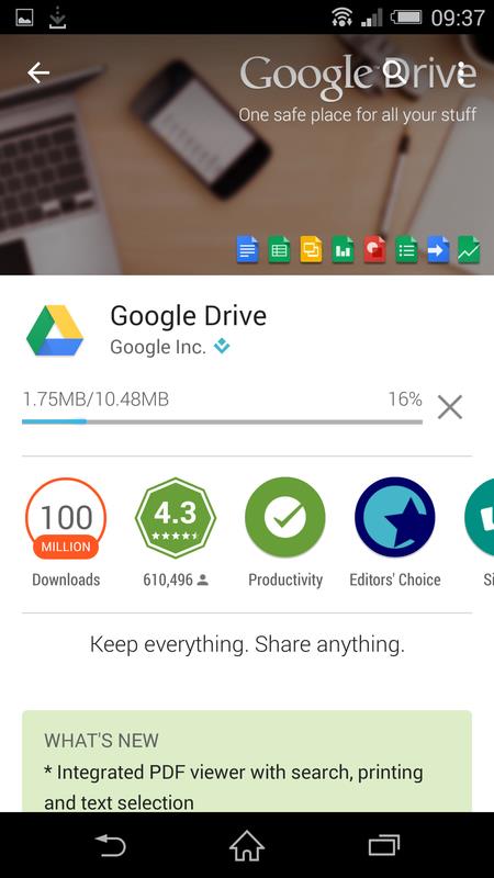
4.Take a photograph of you accessing GDrive on your mobile device. Be
careful not to share any personal information on your photograph